All Blog Posts
-
TuesdayTips205
TV Review
Forensics: Murder Scene

Welcome back! Two weeks ago, the TuesdayTip was a review of Channel 5’s excellent Police Suspect Number 1 (Tip#203). This week, I’m recommending another Channel 5 documentary series Forensics: Murder Scene.
https://www.channel5.com/forensics-murder-scene
As the title suggests, this show focuses much more on the forensic science, with the regular contributors and featured experts largely being crime scene managers, forensic biologists, ballistics experts and other scientists. This time it’s West Yorkshire Police throwing open their doors.
It is an excellent companion piece to the previously mentioned Police Suspect Number 1, and is really useful for those of us whose police procedural fiction likes to feature both the work of the detectives and the experts supporting them.
One of the interesting features of this programme is it is very honest. One of the recent shows featured (I’m being circumspect to avoid identifying the case and spoiling it if you haven’t seen it), was followed for a couple years. It was a detailed and sprawling investigation, featuring some excellent detective work and diligent forensics. To the surprise of these armchair detectives (and the victims and police), the accused were actually acquitted at trial. Formally this means the case remains open, but you got the sense that the police and all those involved are pretty convinced they had the right people, and that for whatever the reason, the prosecution failed to carry the case across the finish line.
The law of double jeopardy means that the accused cannot be tried again, and the circumstances of this case mean it unlikely that an appeal to the Supreme Court would allow this case to be reopened in the light of compelling new evidence. I suppose the only comfort in such cases – and it is very cold comfort indeed – is that the suspects lead the sort of chaotic lives that mean they are almost certain to end up behind bars for other reasons – one can only hope that the damage they inflict along the way is minimal.
I strongly recommend this for fans of the genre, for viewers interested in the processes and science, and for writers seeking authenticity.
What are your thoughts on this show? Are there any other shows you would recommend in a similar vein?
As always, feel free to comment here or on social media.
Until next time,
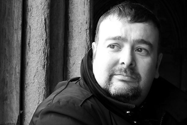
Paul
PS: If you are a writer with a tip to share, or fancy writing a fictional interview between you and one of your characters, please feel free to email me.
-
Forgive Me Father
This is a short story, written for Coventry Writers’ Group. The theme was “Seven Deadly Sins”. This was my interpretation. Enjoy!
Trigger warning – contains references to abuse that some readers may find upsetting.
“Forgive me Father, for I have sinned.”
The confessional is shadowed, but the voice belongs to a young man. Father O’Connell runs through the preamble on autopilot, then settles back to listen to the man’s transgressions.
“I have committed all of the deadly sins,” says the visitor.
“Tell me,” the priest instructs. This’ll be more interesting than the usual old ladies there only because tradition dictates they receive penance before taking communion.
“I confess to pride,” starts the man. “In my appearance and in my accomplishments.”
O’Connell grunts encouragingly.
“And yet I remain envious of others. I have no need for increased wealth, but my greed drives me to gather more. But … sometimes a darkness descends on me, and I can’t bring myself to move. I am consumed by sloth.”
“Do you know what drives these passions?” asks O’Connell, his curiosity triggering a rare interruption. Something about the voice is familiar.
“My upbringing,” says the man firmly. “I was abandoned as a child, then raised in a loveless environment. There was never enough to go around, and the result when I finally had more than necessary was gluttony.”
O’Connell is feeling uneasy. The voice behind the grill has a manic edge. The bishop recently instructed priests to gently persuade those in turmoil to seek outside assistance beyond the spiritual. In O’Connell’s opinion The Church has muddled along just fine for 2,000 years without such nonsense. But, he concedes other professionals might have something to offer; what the man calls sloth, sounds more like depression. Before he can open his mouth, the man continues.
“And then there is lust. The unspeakable, unnatural acts that I experienced as a child awakened dark desires. Devilish desires.”
O’Connell starts to sweat. It’s not possible, he tells himself. After the … incidents … at the home, his then-bishop had moved him on. To this small, far-flung parish. How many priests in the UK share his name?
“Well, Jesus forgives all of our weaknesses,” starts O’Connell. He wants this over, desperate to prescribe a few Hail Marys, then leave by the back exit.
The man giggles. “I’m afraid I’m here under false pretences, Father. I don’t want your help seeking forgiveness.”
“Then what do you want?” O’Connell croaks.
“To complete the set.”
O’Connell casts his mind back. He counts six sins. Panic mounting, he struggles to recall the missing vice.
It is his final thought before the bullet rips through the thin grill separating him from his victim.
Wrath.
-
TuesdayTips204
Writing LGBTQIA+ Characters

Hello everyone, today’s #TuesdayTip addresses a sensitive topic that often worries writers – how to write authentic characters from the LGBTQIA+ community that don’t cause offence.
First of all, I am certainly no expert! I am a straight, white male, whose lived experiences reflect that background. So writing about characters whose identities are different to that requires some extra thought. This article is very much my perspective on the issue, and I am happy to be corrected or educated by those better informed.
In many ways, there are parallels to writing characters from a different ethnic or cultural backgrounds, a theme I explored way back in Tip#77 Colouring Outside The Lines.
Many writers choose to avoid the potential pitfalls by simply avoiding having characters who aren’t straight and cisgendered (the gender they identify with matches the biological sex they were assigned to at birth -ie male or female). The problem, is that when the size of their cast of characters expands, that becomes less reflective of our modern reality and so arguably impacts the realism of the story. Walk down any high street in modern Britain and of the strangers you pass, a significant proportion will identify and potentially live as something other than straight male or female. So if that is the case, then shouldn’t our books reflect that?
This also runs the risk of further hiding and marginalising members of society who don’t fall neatly into one of the two boxes we have traditionally assigned people to.
Another approach is for authors to say “none of this matters – I’m writing a thriller or a murder mystery, not a romance, so leave it up to the readers’ imaginations.” That’s fine. But you do have to take care here. If you think about it, if one of your lead characters is in a heteronormative relationship as part of the backstory and character development (it may not impact the story, but we like our characters to be three-dimensional), then why is such information not included about other characters? All I’m saying is to take care when crafting characters and deciding what characteristics to include.
How Do I Include Realistic Non-heteronormative Characters In My Book Without Causing Offence Or Being Too Heavy Handed?
Well the first thing to do is make sure you’ve done your research. I’m going to largely pass the buck here to a really interesting and useful source “Pride Reads”. [https://www.pridereads.co.uk/] This is a free blog with a regular email newsletter that posts articles designed to help writers navigate this topic. It’s full of practical tips, as well as thought-provoking articles. It is non-patronising and doesn’t preach. I’ve learned loads of interesting stuff that I hope makes me a better person as well as a better writer. There are also useful resources, such as when to consider sensitivity readers etc.
An especially useful resource are articles describing what stereotypes to avoid.
Although I am far from an expert, there are a few useful bits of information that I will summarise here to get you started.
What does the LGBTQIA+ alphabet soup mean?
Over the years, the LGBT acronym has expanded to include ever more letters. So here is a very simple thumbnail sketch of what these letters mean. However, I would urge you to do your own research for a more nuanced and detailed explanation for each.
Please note those marked with ** include the Essential Caveat that how the terms man or woman are used in this context and their definition does matter – you may need to do more research.
L – Lesbian. Women who like women.**
G – Gay – although also including gay women (eg Lesbians), this would often refer to men who like men.**
B – Bisexual – individuals who like men and women. ** This is one that is definitely more nuanced than my one line description.
T – Trans ** An abbreviation of transgender, this is a complex and fascinating subject on its own. It includes, but is not limited to, individuals who live as a different gender to the biological sex they were assigned at birth. This involves a spectrum from those who dress and perhaps live differently to traditional gender norms, to those who have had medical procedures or treatments. It also includes those who are non-binary (they don’t identify as male or female), or who are gender-fluid (their identity may be a mixture or may change and evolve depending on circumstances). This is a really nuanced term and I would urge you to do your research and perhaps sketch out your character before writing them, rather than making it up on the fly. Which is good advice for character development anyway.
(Note the term cis is simply the opposite to trans – so a person whose gender identity corresponds to the sex they were assigned at birth would be referred to as cis. In the same way a person whose sexual preferences are heterosexual might be referred to as straight if it was necessary to label them as such. Remember sexuality and gender identity are two different things, trans doesn’t = gay and cis doesn’t mean straight.)
Q – Queer This is an umbrella term for individuals who don’t feel they fall into the traditional heteronormative way of labelling people. If you use this term, be aware that it used to be a pejorative term used as an insult, but has been reclaimed in recent decades by the community. So consider the context of your story.
I – Intersex this term describes those who physical or genetic characteristics don’t necessarily align with the traditional binary notions of male and female bodies. As our understanding of anatomy has evolved beyond the basic two XX chromosomes = female and XY = male, with the corresponding genitalia, this is now seen as less of a disorder, more a reflection of natural human variation. Again, context is essential here – the language and attitudes towards an Intersex individual, and their lived experiences, will vary enormously depending on the time period, society and culture that your character is living in. The term hermaphrodite is an offensive slur – so don’t use it casually, unless your story needs it (eg as an insult).
A – Asexual This is an umbrella term for those with a lack, or low-level of, sexual attraction to others. Again, it is nuanced and complex, with a spectrum from a complete lack of any desire for sexual attraction or a limited attraction under specific circumstances. Some individuals may be Aromantic – meaning they are uninterested in romantic attachments – whilst others experience romantic or emotional attraction to others and desire intimacy, but not necessarily sexual intimacy. Some individuals may engage in sexual activity, for a range of reasons ranging from the practical (eg procreation), for companionship or to please a partner. Obviously, this is a potentially very sensitive subject, so again develop your character accordingly. Asexuality is different from celibacy – a choice to abstain from sexual activity.
+ Plus – everything else. As you have no doubt realised, sexuality and gender identity is a complex and changing landscape. The plus represents that. There are many other terms and identities such as pansexual and individuals may come under one term, be represented by multiple terms or perhaps not feel that they fit any terms. The plus allows for that diversity.
Some simple take messages that I have learned.
Fair and accurate representation is what’s important
From reading the blog posts by Pride Reads and other sources, it seems that what LGTBQIA+ readers (and viewers) want most of all is to be recognised and made a part of the stories they read. They aren’t asking for special treatment or demanding that all stories have visible lead characters from their communities. What they want is to read strong, well written stories that reflect society as it exists and where appropriate recognise their community’s role within it. They don’t want to be shoe-horned in to increase diversity, rather they want characters that exist in an organic manner and have their role to play, big or small. Just like anyone else in society. Don’t use sexual or a gender identity as a way to make your writing more diverse, rather try to write naturally diverse and realistic stories that happen to have a range of different characters. You aren’t playing diversity Bingo!
Identity does not have to be the “story”.
The sexuality or gender identity of characters does not necessarily have to be a story in and of itself. Ask yourself this question. If you are writing a police procedural, how is sexuality and gender identity addressed for your heteronormative and cis characters? Do you dwell on your male detective’s relationship with his wife? If not, why would you dwell upon a lesbian character’s relationship with their girlfriend? If you mention a detective is having difficulties because her long hours are affecting her homelife with her husband, then could a gay detective be having the same issue with his husband? Try not to treat LGBTQIA+ characters differently, just because of their sexuality, unless it is key to the story.
Coming Out stories are tricky
A recent article on Pride Reads stated that many LGBTQIA+ readers are getting bored of “coming out” stories. Every person is different and experiences can vary enormously. Writers don’t usually write about heteronormative characters’ journeys to accept their sexuality or how they announced it to their loved ones, so unless it is really necessary and a part of the story, don’t feel compelled to explain how your lead detective came out to their loved ones twenty years ago. In other words ask if it is necessary or just a way to convince yourself that you are a diverse writer.
Killing LGBTQIA+ characters
The final point is a sensitive issue. Oftentimes LGBTQIA+ readers feel that queer characters are disproportionately killed off or treated as victims. A recent well-known thriller series (I’m not naming it to avoid spoilers) culminated in the queer lead characters dying at the end. Some viewers, who had grown very attached to the characters and felt that their visibility in the series was an important cultural landmark, were very upset. Others suggested that the denouement of the story needed the characters to die for closure, and it was irrelevant that they were queer. That’s an argument for another day. All I would urge is regardless of your intentions, carefully consider if killing that character because they are queer is appropriate, even if you think you are doing an important job eg highlighting an issue. But then the same argument should be applied to other situations eg fridging (killing a token female character so the male characters have an excuse to exact revenge) or ‘white saviour’ stories where a heroic white character gets justice (and accolades) for saving or avenging people of colour.
At the end of the day, if you feel unsure if your stories chime with the times, are accurate, or risk offence, consider seeking the opinion of sensitivity readers. Your publisher may be able to help with this, or you can contact organisations such as Pride Reads for advice.
What are your thoughts on this topic? Do you have any advice or recommendations? As always, feel free to comment here or on social media.
Until next time,
Paul
PS: If you are a writer with a tip to share, or fancy writing a fictional interview between you and one of your characters, please feel free to email me.
-
TuesdayTips203
TV Review
Police: Suspect No.1
Welcome to this week’s TuesdayTip.
This week’s tip is another TV review. This time, it’s the turn of Channel 5’s Police: Suspect No.1.
For fans of true crime and policing shows on TV, there is no shortage of programmes to watch. However, the quality is variable, and it is important if you want to get accurate information for your books that you watch programmes relevant to what you are writing, including the correct jurisdiction.
It seems that the main UK terrestrial broadcasters each have a “flagship” fly-on-the-wall series. I’ve previously recommended Channel 4’s always excellent 24 Hours In Police Custody [Tip129] and the equally valuable Forensics: The Real CSI from the BBC [Tip184]. Police: Suspect No.1 is Channel 5’s offering.
You can watch the series on the catchup service https://www.channel5.com/police-suspect-no-1.
Like its stablemates, the show follows an investigation from the emergency call, with the first responders attending, the gathering of evidence at the scene and we meet the detectives, police officers and specialists right from the beginning. Bodyworn camera footage, cameras in the incident room and documentary crews following the teams give a real insight into the process as it unfolds. We see CCTV footage and watch specialists as they track phone data etc. As always those involved speak to the camera and explain what is going on. We also see the toll on the detectives and the distress and revulsion they often experience.
One difference here is that unlike some other programmes, the suspect is often tracked down quite quickly. We then see the detectives trying to find them, and when they are arrested or taken into custody, the focus shifts to trying to prove (or disprove) they have the right person and to unravel what really happened. This involves footage from inside interview suites and the team as they try to interpret forensic evidence and wade through witness accounts or trawl through CCTV. The custody clock is often an ever-present pressure as they race to convince the Crown Prosecution Service to agree to a charging decision.
As a writer of police procedural fiction, I find these programmes invaluable. I often learn little snippets that I can use later. In one episode the accused refuses to accept a solicitor, despite repeated offers. This hubris is their undoing and armchair detectives such as my wife and I watched in dark amusement as the smart-arse suspect made basic errors and said things that any competent duty solicitor would have strongly advised them not to say. Most telling was the detectives decision that without a solicitor to request disclosure of evidence, they weren’t going to give him anything before the interview to help him fabricate a more convincing lie. The suspect went into their interviews completely blind, with no clue what evidence the police had amassed against them. The dawning realisation that they had royally screwed up was grimly pleasurable to watch.
As always, there is the pay-off at the end when we find out the outcome when the accused have their day in court.
I heartily recommend this for fans of the genre and for writers seeking authenticity.
What are your thoughts on this show? Are there any other shows you would recommend in a similar vein?
As always, feel free to comment here or on social media.
Until next time,
Paul
PS: If you are a writer with a tip to share, or fancy writing a fictional interview between you and one of your characters, please feel free to email me.
-
TuesdayTips202
Keeping it Synchronous

Hello and welcome back!
This week’s #TuesdayTip is looking at Synchronicity within a story.
A basic definition of the word is as follows:
“The simultaneous occurrence of events which appear significantly related but have no discernible causal connection.”
Why is synchronicity a popular device? Why do writers decide that in one book, or a particular TV episode, there will be a theme of parents being ill?
Leaving aside the great Terry Pratchett’s assertion that million to one chances happen nine times out of ten, coincidences do happen. But there are other good reasons:
- Synchronicity allows writers to explore a particular issue in depth, by having more than one instance to compare.
- The details of one event might give characters insight into another similar, but unrelated event. The classic example being the detective having a eureka moment, when they realise that they ‘have seen this before’.
- It can be used as a way to bring two characters together. Eg two characters who have been stood-up, meeting at a bar.
Another example is when the lives of different characters seem to be following similar, yet unrelated trajectories.
For example, Character A‘s father is suffering from severe dementia, and they are likely to die soon.
Character B receives news that their father has been diagnosed with a terminal illness, and they too are expected to die soon.
The two events are unlikely to be related and so can’t have any causal connection.
This gives us an opportunity to explore the individual characters’ psyches. How do different characters deal with ostensibly the same situation?
Take Character A. He has always been very close to his parents, supporting them throughout his father’s dementia journey. He cherishes the last few memories he will make with his dad. He decides to take a leave of absence to spend the last few weeks with his dad and to support his mother.
Character B found about her father’s illness via text message from her sister, who she rarely speaks to. Her father was a cruel man, and Character B couldn’t leave home fast enough. Her response to the text message is “good”. She goes to work as normal and refuses her sister’s entreaties to see her father one last time and clear the air.
These two characters are dealing with the largely the same problem in different ways. But what if they are friends? Character B hasn’t told anyone about her father, but Character A notices that something is wrong. Character B watches Character A as he deals with his father’s impending death and is struck by how, amidst the sadness, there is laughter and perhaps even relief, despite his deep love for his dad and his impending loss. On the other hand, she should be glad that the man she’s hated since childhood will soon be dead, yet she feels angry and frustrated at the world and struggles to concentrate at work. By contrasting the two characters, we see the difference between them. It also allows Character B to see her own issues through the prism of somebody else, and the reader learns more about her and her demons.
Another, related issue could be a Red Herring (#Tip153).
An example might be the neighbour of a murder victim hearing a scream at precisely 11:42 am. Detectives are confident that this was the victim being killed. CCTV from around the corner shows a young man, in coveralls apparently stained red, running hell-for-leather down the street a couple of minutes later.
After extensive investigations throughout the book, the young man is identified and arrested. The reason he was running? To catch the bus. The red stains? Paint.
The use of synchronicity is more than just the writers running out of ideas. It’s a powerful narrative device that can help an author explore issues in more depth.
What do you think about synchronicity? What other uses can you think of? As always, feel free to comment here or on social media.
Until next time,
Paul
PS: If you are a writer with a tip to share, or fancy writing a fictional interview between you and one of your characters, please feel free to email me.
-
POETS Day
This is a short story, written for Coventry Writers’ Group. The theme was “5:30pm”. This was my interpretation. Enjoy!
The office block was normally populated until at least six. But this is London, and today is POETS day – that’s Piss Off Early Tomorrow’s Saturday for the uninitiated. The woman in the coffee shop ticked off names as employees left the building.
Finally, everyone was gone. Except for one person. Pulling her cap down low, and, avoiding the CCTV above the café exit, she crossed the street.
Entering the building was easy. The T-shirt with the cleaning company’s logo was as good as any swipe card. The security guard barely looked up from his phone as he pressed the door release. Minimum wage – you get what you pay for. Same goes for service staff – a depressingly small bribe was all it had taken to convince the regular cleaner to stay home.
His office was on the fourth floor. He’d found her on Tinder. It seemed that screwing a cleaner on his desk was a fantasy his wife was reluctant to fulfil.
Pausing briefly to put on some rubber gloves, she knocked on the door marked Vice President – R&D. He turned in his chair, his eyes full of lust.
The wall clock hit 5:27. Any second now …
The fire alarm almost deafened her.
“Shit,” he said. “We can’t ignore it. I’ll go first. You give it a minute.” He smiled reassuringly. “Don’t worry, I’m sure it’s a false alarm.”
She nodded as he left, hastily buttoning his shirt. So easy …
He hadn’t even locked his computer, which saved her time. Within ninety seconds, everything she needed was on a memory stick.
He’d followed his proscribed evacuation route; down the stairs and out the front. She took the rear fire exit. In the stinking alleyway, she removed the T-shirt, cap and wig and slipped them in her bag and placed the envelope of cash where the security guard would find it.
Opening her phone, she deleted the carefully-crafted Tinder profile.
The last thing she saw before removing the phone’s battery and SIM card was the clock on the screen flick over to 5:30pm.
-
TuesdayTips201

Scene from The Italian Job. (c) Paramount Pictures 1969
Keeping Them (Cliff)hanging.
Welcome to this week’s #TuesdayTip.
I recently watched a debate on a Facebook readers’ group about cliffhangers and whether readers liked them, thought they were necessary or just a cynical way to ensure readers bought the next book in a series. There were a variety of opinions expressed, although I am pleased to say that the discourse was largely respectful.
Before we go any further, I think it would be helpful to get some definitions.
What do we mean by a cliffhanger?
For those unfamiliar with the term, it is a narrative device whereby a chapter, instalment, episode or book is left unresolved. In order to find out what happens next, the reader (or viewer) needs to continue reading or watching the story. Often the protagonists are left in danger, or a seemingly impossible situation. Perhaps a major revelation is made.
The technique has been around for a long time. The epic Arabic tale One Thousand and One Nights, dating back to the middle ages, sees Scheherazade telling a new tale each night to King Shahryar. By ending each story on a cliff hanger, she successfully postpones her execution, as the king is desperate to hear how each story is resolved the following night.
More recently, luminaries such as Charles Dickens would end each instalment of their serialised novels with a cliffhanger to entice readers to buy the next episode. In modern times, continuing dramas, especially soap operas, rely on this hook to ensure viewers or listeners tune into the next episode, or return after the commercial break.
The phrase is likely to have originated in the 1870s when a serialised version of Thomas Hardy’s A Pair of Blue Eyes, literally left the protagonist hanging off a cliff.
What different types of cliffhanger do we find in modern story-telling?
The most common example is at the end of the chapter. One of the best accolades a writer can receive is that their book was ‘unputdownable‘. That readers stayed up later than planned, because they wanted to read just one more chapter, or binge watch another episode. The trick here is to leave a hook that needs to be resolved. In thrillers, this may involve the protagonist being placed in danger. In crime and mystery a new revelation or perhaps a twist that means everything to date was incorrect. In other genres it could be a surprise or a shock.
Of course, immediate resolution in the next chapter is only one solution here. Something that a lot of writers do is harness the power of delayed gratification. Many stories have several different threads or character arcs running alongside each other. A common device (trick?) is to finish a scene on a cliffhanger, then switch to a different thread, leaving that cliffhanger to fester in the reader’s mind. This can be really effective, as instead of reading one more chapter, the reader might read several more until they find the answer they are waiting for.
Skilled writers walk the fine line between teasing readers and encouraging them to continue, and frustrating them, so that they give up or give the book a poor review. A really skilled writer lingers in the thoughts and dreams of their readers after they are forced to put the book down, go to sleep, then work the next day.
There are plenty of other places for cliffhangers.
Mini-cliffhangers at the end of key scenes, before a section break, rather than a chapter. In broadcast media, this entices you to return after the commercials (or hopefully sit through them).
For serialised stories, the cliffhanger can be a hook that makes you seek out the next edition of the magazine. This is pretty much the business model for modern superhero comics. A typical comic will have several different stories, all at different stages, sometimes even spread across different titles, so that readers will find themselves not only buying comics week-in-week-out for months or years, but even buying different titles. Even when you finish the first story, you’ll have probably read the other stories in the comic and will therefore continue until you finish those stories, probably starting new ones ad infinitum. Sometimes you might have to hop from an edition of The Amazing Wonder Bloke to an edition of Wonder Bloke and Friends to Wonder Bloke and Wonder Lass to get the full story, encountering new, ongoing stories as you do so. Personally, I dislike that form of storytelling. It is blatantly trying to get you to part with more money – but there’s no denying it works, and to be fair, readers know how it works.
One of the objections some participants in the original forum had was leaving a cliffhanger at the end of a novel, so you have to buy the next in the series. I can see their point. It’s one thing to publish a serialised story where everyone understands that you are subscribing for the long haul, but another to sell readers a £10 paperback, where the readers typically expect the primary story to be wrapped up. Obviously, on-going series might have story threads that continue, but again it is a fine line enticing a reader to consider the next book in the series and leaving them feeling unfulfilled, unsatisfied and perhaps even a bit manipulated.
In summary, cliffhangers are one of the most powerful tools that any writer has, regardless of genre. But you have to treat your readers with respect. By all means entice them to continue with the book, or even a series, and I would argue that when it comes to making a reader read just one more chapter, anything goes. But when a book is finished, the main story should be concluded.
One last thing: If you are going to end a book or an episode on a major cliffhanger, please at least have the courtesy to finish that story in a future instalment. American network TV has a really nasty habit of pulling TV series halfway through a run, or unexpectedly not renewing for a new season. Think Terminator: The Sarah Connor Chronicles or more recently Legends of Tomorrow.
What do you think about cliffhangers? Clever narrative devices that enhance our enjoyment, or shameless attempts to extort money? As always, feel free to answer here or on social media.
Until next time,
Paul
PS: If you are a writer with a tip to share, or fancy writing a fictional interview between you and one of your characters, please feel free to email me.
-
Why Generative AI using pirated datasets of copyright works is a threat to us all.
Over the last few days, you may have seen posts from authors outraged that their copyrighted works have been used to help train Generative Artificial Intelligence models, without their permission or offers of fair compensation.

The recent controversy concerns a massive archive of 7.5 million pirated novels and 18 million research articles, called LibGen. It is alleged in an article in The Atlantic that Meta (owner of Facebook, Instagram and WhatsApp), decided that rather than pay licences for this material, they would simply download and incorporate this illegally pirated, copyright material into their Large Language Models. They basically circumvented the established methods for obtaining such permission to save money and time. Allegedly, the green light for this came from the very top, ie Mark Zuckerberg.
All 13 of my DCI Warren Jones novels are included in the dataset.
The aim is to allow AI chat bots to generate new material in the style of previously established authors, using existing characters, with no permission (or compensation) offered to the owner of such material. Furthermore, the models will learn from the writing skills of authors, honed over many years, to generate new works to rival those of hardworking, skilled writers. Potentially, users of the model will simply be able to ask the bot to ‘write me a story about subject X featuring these characters, in the style of author Y‘. They may keep it for their own pleasure, or package it and distribute it as an eBook, either for free or a small fee.
This is a threat to the whole ecosystem of writers.
Why, I hear you ask, should a mid-list author such as me (and 99% of other writers) be concerned that folks are generating new Jack Reacher novels for their own pleasure? Millions of readers will still rush out to buy the latest Reacher novel. The bank balances of superstar authors will probably only take a small hit.
But consider this. I am a typical, avid reader. Over the course of a year, I have a number of go-to authors, such as Lee Child, Michael Connelly, Karin Slaughter etc. I will always buy their latest book. But between those tent-pole releases, I read many other books. Books by other, mid-list writers such as myself. I try new novels that don’t bother the bestseller charts, written by authors whose writing income is usually only a part of their livelihood, because median author earnings (ie most of us) are less than minimum wage.
Now let’s assume somebody uses AI to generate 5 new Reacher novels, releasing them for pennies or even free. Sure, they aren’t a patch on the real thing, written by Lee or Andrew Child. But they contain all the elements of a Reacher novel, they are fun and they provide a Reacher fix until the next one is released by the Childs.
But whilst I’m getting my AI Reacher fix, what am I NOT reading? Which 5 mid-list authors will I never discover? Whose sales figures will be impacted because there are only so many books a person can read in a year? Which authors will have to slow their output, or even quit altogether, because their writing income is unsustainable and they have to spend more time doing other jobs?
That is something we should all worry about.
I am less concerned that Amazon will be flooded with AI knock-offs of my DCI Warren Jones characters, than I am that fans of police procedurals who have finished their favourite author’s output won’t give mine a go, because they can generate a brand-new DCI Banks, or Roy Grace or John Rebis novel for free, or download a new adventure of their favourite character for pennies.
Other authors are NOT my competition, they never have been. We promote each other’s work because we are fans of each other. Book bloggers and keen readers flood social media with recommendations of similar authors. If I go onto any Facebook readers group and say that I’ve read all of a particular author’s books and fancy reading something similar, the comments will be flooded with helpful suggestions. Sometimes I am flattered to be included in the same post as other writers I admire. I have gained many new readers this way. How many potential new readers will instead stick with what they know, rather than taking a punt on someone new?
And that is why AI generative novels are a threat to us all.
-
TuesdayTips200
Block Buster
Ideas To Thwart Writer’s Block

Puzzling Prompts
Hello, everyone, it’s great to be back, after several months rebuilding a new website and being snowed under with work!
Today’s Tuesday Tip is a quick Block Buster – a short exercise to either bust your writer’s block, or just a fun writing challenge to practise your skills.
Today’s exercise is a way of both generating a writing prompt and helping you justify the guilt from procrastination.
I’ve said before, that a short writing exercise is often a great way to get your brain in gear and those creative juices flowing, but a blank piece of paper can be a scary prospect.
Instead you need some sort of prompt.
One of my favourite types of prompt is a word or word(s) that need to be incorporated into a short piece of writing.
But how to generate them?
I, like many people, have a daily routine that involves online word puzzles. I justify the time taken as a means of keeping my brain working and enriching my vocabulary (although it should be noted that these games steadfastly use US spellings).
One of my favourites is the word game Wordle – the aim is to deduce a five-letter word by seeing which letters in the answer are present in words that you guess.
Why not use the answer as your writing prompt?
Fancy a bit more challenge?
Quordle follows the same rules as Wordle, but you have to simultaneously guess four words.
Why not set yourself the challenge of incorporating all four words into your short story?
Feeling really confident?
Octordle, as the name suggests involves the guessing of eight words.
Both Quordle and Octordle tend not to be thematic, so the collection of words can be really eclectic.
Worried that you might not know the meaning of a word? The games have links to an online dictionary that provides definitions.
Good luck!
Remember the rules:
- Set yourself a time limit.
- Write without stopping, editing or overthinking.
- Write whatever comes to mind and don’t worry if it doesn’t make sense.
- It doesn’t matter if it has nothing to do with the scene that you are stuck on.
If you are a writer with a tip to share, or fancy writing a fictional interview between you and one of your characters, please feel free to email me.
Have fun,
Paul
-
Author Roadshow Coventry Library
“Date For Your Diary”.

I’ll be taking part in the Author Roadshow at Coventry Central Library on Saturday 8th March from between 11am and 1 pm.
Come along and say “Hi”.
Meet other book-lovers, chat to authors and buy signed copies!Local Authors Include:
- Malcolm Rose
- Angie Moon
- Adam Wood
- Ruth Cherrington
- Chris Arnot
- Helen Chinn
- Alex Stone
- Ann Evans
- Zen Cho
Can’t wait to see you all!